Showing posts with label book covers. Show all posts

Saturday, 30 August 2014

Read this guide before making or choosing your book cover.

They say 'Don't judge a book by it's cover,' so it doesn't really matter

What complete rubbish! Getting a book cover right is vital because unless it catches the eye of someone looking for a book, they will never read the description, never read a sample and never make a purchase. If you are an indie author your cover will make a huge difference to your sales.

Do you even know how to recognise a good cover?

  • What do you know about how color affects emotions?
  • Have you ever heard about the rule of thirds?
  • Do you know about the golden ratio?
  • How well do you understand typography when choosing fonts?
  • How long should a title be?
  • Is it worthwhile using a subheading?
  • Are you allowed to use that image?

The Cover Image

Few books are successful without some sort of cover image. A good cover image should give the reader an idea of the book content. Look at the image used without any title or author text. Does it give you an idea of what to expect? Take a look at the five covers shown above. Do any of them match this book description?
With her mom in prison, and her father AWOL, ..... is sent to live with a squeaky-clean family who could have their own sitcom. She launches a full-scale plan to get sent back to the girls’ home when she finds herself in over her head...and heart. 

Is there any sort of formula for judging a cover image? I would suggest looking at it without the text. Does the image give any idea of the book content? I'm judging them on Amazon's thumbnail size - what a reader will see first.
  • Silent as the grave - A large, old house, possibly an institution of some kind? Certainly NOT a castle as the book description indicates - Expectation: Ghost? Horror? 
  • Fresh doubt - Looks like a derelict factory. No clues here other than a man is standing in it - Expectation: Business venture?
  • In between - A young girl, obviously not well off. She's going somewhere - Expectation: New situation for a teenage girl
  • To kill for - This image is too dark to make out at this scale. If you examine the book preview you can make out the object in it is a blood splattered tyre ('tire' for US readers) wrench. It can't be made out clearly at the thumbnail size though. Pretty useless as an image. It's the author name and title text which will sell here - Expectation: Something 'dark'
  • Where there's smoke - Someone with a lamp overlooking a desert or sea; it could be either at this scale. The clothing doesn't look western style - Expectation: Story about Africa or Asia

Author Name

Of all the text on a book cover, the most important bit is not the book title but the author name! Take a look at the top five free e-books at Amazon UK (4:00pm Saturday 30th August 2014)

Notice how clear the author’s name is in each case? Many new authors make the mistake of selling a book title when they should be selling their brand. Once you’ve bought and read a particular title you wouldn’t buy it again but you might search for other books by that author. An author’s name is their brand. Make the author name clearly visible even at Amazon's smallest thumbnail size of 58 x 87 pixels. Here's an example at that size:


The Title (and sub-title)

A good title is one which will catch interest without a cover image helping it. Consider these titles:
Do any of them grab your attention? My analysis is as follows - I'll explain EMV in a moment.
  • 'Silent as the grave' suggests to me a paranormal death experience - EMV without the subtitle 0% but with it 41.67%
  • 'Fresh Doubt' suggests something to do with a criminal conviction - EMV score with or without subtitle 0%
  • 'In Between' suggests a change of lifestyle and the use of 'production' in the subtitle possibly indicates a theatre or film. - EMV score without subtitle 0%, with 50%
  • 'To Kill For' suggests a murder. The use of 'family' and 'trust' makes it much more interesting - EMV score with subtitle 60%
  • 'Where There's Smoke' suggests the reader add 'there's fire' at the end and implies one event suggests another - EMV score 0% even if you include the 'there's fire'
Two things you need to know - 
  1. According to Mark Coker of Smashwords, fiction books with shorter titles tend to do better. The top 100 best selling books average 4-5 words
  2. EMV stands for Emotional Marketing Value. Words in various languages have been analysed for their emotional impact. Normal English has about 20% words which carry emotional marketing value. A really good title would have 40%. 60% is excellent
Of course you want to know how to measure the EMV of your title. It's easy to do on-line at http://www.aminstitute.com/headline/index.htm Enter your headline in the box and select 'Media & Communications' as the category. Your title must be at least four words (and less than 20). If your title is shorter than that, add some neutral words such as 'as', 'the', 'and' or 'if' until you have four words. Remember - as the 'Fresh Doubt' and 'Where there's smoke' books show, it's possible to have a successful book with a low EMV score but you'll need an exceptional cover image or a recognised author name for that.

Getting a cover made for a low price

If you’re really stuck for cash and you can’t produce your own cover then consider getting a cover from http://fiverr.com. This site will put you in touch with a number of people who will produce a cover for just $5.00. Use caution here though – make sure any images they use are not copyright.

What are your views?

I used the five top free ebooks at Amazon as my examples. I have not read any of them (yet) so I can't honestly suggest you read/don't read any of them. If you are interested, I've added a link to each which takes you to your local Amazon. There is no guarantee they will always be free though - check before you download.
I would be interested to find if you agree with my analysis of the images and titles though. Feel free to add your own interpretation in the comments

Follow-up

It’s more than two years since I recorded the position of those books at Amazon UK. Where are they now? (September 2017)
Silent as the Grave is no longer free (£1.99). It ranks #210,656 in paid books. It’s no longer given a ‘bestseller rank.’
Fresh Doubt is no longer free (£1.99). It’s doing quite well at #20,762 in paid. It’s now #274 in International Mystery & Crime.
In Between is still free and performing strongly at #267 in free books. It’s #2 and #3 bestsellers in three romance genres
To Kill For is still free and #1,192 in free books. It has a new cover It’s #5 bestseller in Crime Fiction > Noir

Where There’s Smoke is no longer free (£0.99). It ranks #3,214 in paid books. It’s now #62 bestseller in Women's Literary Fiction


If this post has helped or entertained, will you help us? Download a FREE copy of our book 'Immortality Gene' from http://smarturl.it/avi
Even if you never read it (but we hope you will) - it will help our rankings.
And here's the cover - see what you think:
Look - a FREE e-book

Thursday, 21 February 2013

Creating Book Covers - 1

If you search the Internet you'll find lots of advice on how to write and also lots about how to get published. Up to now the route has always been:
  • write the book
  • edit it
  • submit it to an agent
    • get rejected
    • submit to another agent
    • get rejected
    • revise the book
    • repeat 'submit to an agent
  • Either give up or self publish or, if you are one of the lucky few, negotiate a contract
  • Agent submits to a publisher.... and so on
Now however E-books have made it possible for many new authors to publish work that would otherwise end in agents and publisher's slush piles. You can test the water by releasing your book as an e-book, publicize it yourself (For how to do that read John Locke's excellent book 'How I Sold 1 Million... ') and then, if there's a demand, produce a paper copy. I wrote an e-book on the process of producing both the paper copy and the e-book version. You can either buy it at Amazon or get it free here.

Somewhere along the line though you'll need a book cover and there the advice stops. Granted there are websites which offer template solutions but most of them leave a lot to be desired and frankly - a book is judged by it's cover.

We've written and published five books so far in our A Vested Interest series and in the hope that our experience will help, here's what was involved in designing the covers. In a future blog post I'll cover the technical side of creating the covers.

We wanted the cover of this book to reflect what the story was about so we had to include:
  • DNA to indicate this was about medical science
  • A semi-transparent mechanical bug to show that technology was involved
  • A castle to represent the location Langston Castle in the book and to show there was a bit of history involved
  • An old mine tunnel to represent the secret underground base
Now Shelia and I are not bad at using graphics programs - we picked up that skill when we spent three years as illegal immigrants in Canada, supporting ourselves by building websites. So we took some pictures using a very basic digital camera and started putting together a cover. The actual process I will detail later but here's the result:
The original background image was a picture I took of Blackett Level near Allendale, Northumberland. It was a little overpowering so I faded it out by putting a semi-transparent white layer over the top. Into that I merged a picture I took of Langley Castle and that DNA picture. The 'bug' was inspired by those in the film 'The Day the Earth Stood Still'. On the e-book copy we moved that to the other side. Later we added the Triplet family coat of arms to help identify the book as part of a series. Now this cover is  in the 'It's OK' class. and after a year we decided it needed re-working. At the same time we took the opportunity to change the title to give readers a better idea of what to expect. The main theme of the book is the development of a genetic 'fix' which allows mankind a much longer lifespan. That being the first step in taking humanity to the stars. We kept the original title as the book series title and changed the title to Immortality Gene. Here's the second version of the cover:

The plot of this book involved an unpleasant secret buried in the family for almost a thousand years. The secret was revealed in an old diary. To reflect this we created a cover looking like an old book and featuring the coat of arms of the Triplet family. The old book was to be dark colored to reflect the title but when we got the first proof back from the publishers it was almost black. The final version was a lot lighter. For the old book I scanned an old copy I have of Uncle Tom's Cabin and then removed the text. With the aid of my son Adam we created a 'coat of arms' and then turned it and the book cover text gold.

On this one we didn't put the coat of arms on the spine since it was already on the front cover and the spine is much narrower.

Book 3 - No Secrets
No Secrets was very much a continuation of Dark Secrets so we decided to use the same layout. Obviously we couldn't use the same image on the front so chose a Celtic knot instead, symbolizing eternity. Of all the covers it's the one we are least happy with and it may change.

Book 4 - Stones, Stars and Solutions
In this book the Triplets travel the world visiting pyramids and other locations while following clues left in an ancient document. One of the locations is Death Valley, another is the Mayan pyramid at Chichen Itza, Mexico. We started with a black and white picture of Death Valley which we colored dark blue. To that we added the pyramid viewed through a 'window' on the front cover and framed in vegetation from the jungle in Mexico. On the back we added our idea of the power mechanism revealed at the end of the book.
People liked this cover so much they asked if they could use it as a screen background. We obliged with a version without the text, coat of arms or vegetation. Find it here.

Book 5 - Leap of Faith
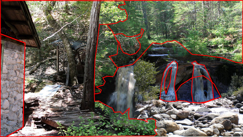
In this book there's a location Spirit Canyon in Arkansas. It was one of the places mentioned in Stones, Stars and Solutions and also appeared in No Secrets. Spirit Canyon features a stone cabin which you can only get to through a cave and a waterfall. We wanted to show this place on the cover. The problem is that though we know it's location, the actual place doesn't exist so we had to make it with bits and pieces of other pictures.
For a book cover you need high resolution pictures because the file you send to a printer is 5,700 by 3,900 pixels in size although the image I need is 3,510 by 2470 pixels. I start with a template document from the printer. It's actual size depends on the size and thickness of the book. If you use CreateSpace as your publisher this template is worked out for you when you upload the book contents. It can be a little difficult to find but it's there.

Here's what we started with:

  • a picture of a log cabin in Texas
  • A cave in Arkansas
  • A woodland picture in Arkansas
  • A stone cottage near where we lived
  • A picture taken inside the old lead mine at Swinhope Moor, England
  • a blue eye

   ...and here's what we ended up with
In case you wonder, here's where the joins are...

Now this picture is a little busy for a book cover and it's not perfect. I chose to add text with a semi transparent background to hide the imperfections.

Making a cover like this isn't hard. You just need a computer with lots of memory and a decent painting application which can use layers, masks, feathering and  bézier text. The industry standard program is PhotoShop, but there are others such as Corel PaintShop Pro or The Gimp which can do the job and are much less expensive. There are lots of tutorials available on the web explaining exactly how to merge images so I don't plan on explaining this here.

 I'm still not happy with the front and spine text on the cover since although it's fine on a printed book it fails to stand out in the smaller versions used for e-books and at Amazon. The spine text could be made clearer by turning it through 90 degrees but I, for one, hate having to turn my head sideways to read the text on book spines. I'm also a little dubious of the base of the stone cabin which doesn't quite fit on the ground correctly. I probably need to add some weeds here to cover the join.

What's wrong with this cover?
  • It's too busy
  • The text fails to stand out against the background
  • The author names are too small. At Amazon's thumbnail size they are unreadable.
This one desperately needed a new cover. My son Adam worked on it and produced a new image for it which I cloned sideways to make it wider and then added text to it. Here's the new cover:
The cover shows the moment when Kate and her five year old son Tom take the 'Leap of Faith' from which the book get's its name. Now tell me, what emotion do you think Tom is feeling?

Regret and Retribution

We've now added an additional book 'Regret and Retribution'. In this book some of the action occurs on the top of a mountain in Arizona where the characters come under attack by a hostile alien. Fortunately, the alien  takes human or animal form, so I didn't have to come up with what he/she looks like. I used a modified sky scene from Death valley (used already in Stones, Stars and Solutions) and to that added a mountain top scene. The actual mountain used was Helvellyn, a mountain of England's Lake District. In fact I used it twice, once in the background and again, mirrored and stretched in the foreground. On the rear mountain I superimposed a modified picture of  a galaxy. The whole thing was darkened and a faint blue glow was added at the edge of the foreground mountain.. Finally I added the cover text. The trick here is to make sure that it's readable even at a thumbnail size used on Amazon's website. Here's the result:

Consequences

Consequences was released at the end of July 2012. It's cover shows a moment when Donna was released from a 'mindstorm'. It's dusk, raining hard and misty. The helicopter searching for her is driving the rain and Donna holds her hair to prevent it lashing her eyes. She spots something on the ground and reaches for it. We used the same mountain top but added storm clouds. The figure of the woman caused a few problems, it's actually made up of four different images. She's making an unusual movement - reaching with her left arm over her right knee. I would have swapped arms but Shelia, who has long hair, told me 'Once you have your wet hair in a strong wind under control, you don't risk letting go.'

Ashes to Ashes

Here's our most recent book cover for 'Ashes to Ashes'. We start this book with the aftermath of an alien possessed woman running wild in the mine complex. Death plays a big part in this book at it's beginning and that is reflected in it's cover. I think, with practice I'm getting better at doing these covers and this one is very effective both on a paper book and as an ebook, even when shown as a tiny thumbnail. What do you think?
Here's just the front of the book: